Tea Circus is a quirky brand of teas that uses traditional tea blending methods. They wanted to create a brand that portrayed the circus theme as well as the concept of tea. The logo symbolises both tea thanks to its teapot shape and the circus with a big top patterning.
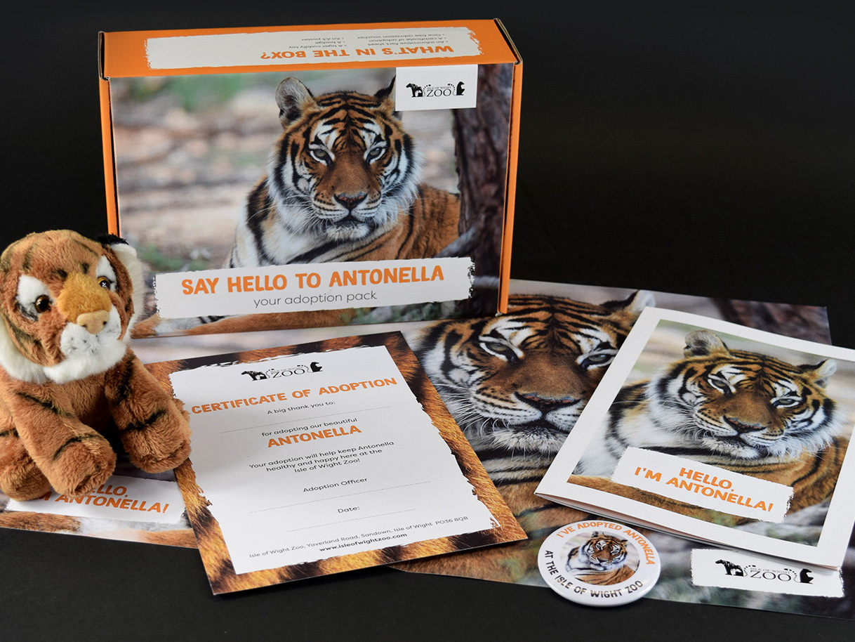
The packaging needed to be fun and unique so I came up with the idea of using circus acts to portray each individual tea. There will be more in due course!
Thanks for looking!
